The End
After the long process of production and just recently a tad of polish, the final build and end product of Familiar is now available!
Art
Hi there and welcome to the last part of the art devlog! It’s been a long journey up until this point, and it’s really awesome to see everything come together now. There weren’t any life changing tweaks for these last couple of days, but a bunch of subtle updates that added up to the game feeling quite a bit different in the end.
Our paths are now quite a bit more visible since we got feedback that it was kind of hard to find the healing shrines in the dark.

Also, our UI looks very different now! We have actual character portraits in the game, and bars for health and dash charges. You may also note that if your tether breaks, the health bar suddenly goes red, just to really make you feel like “oh boy, we screwed up”. Implementing this meant diving a little deeper into blueprints than just being able to follow a youtube tutorial step by step. It was a big learning experience but it really paid off, and luckily I had our devs there to help push me in the right direction.

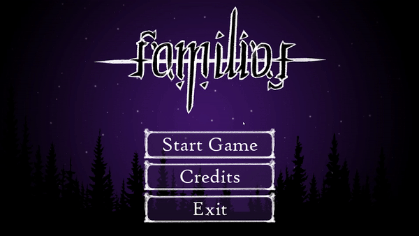
Other than some subtle tweaks here and there in menus and our level, I also worked on our logo.
It took quite a bit of brain power but I’m really happy with how it turned out.
You only really realize it once you turn it upside down, it still says “familiar” all the same!
My goal was to signify how our two siblings are two sides of the same coin and I hope it will serve as a nice cherry on top of the finished game.
 Hope you enjoy the game and see you again soon on another project!
-Lorena
For this week there were a few fixes for the old FX, as well as a couple new added FX. Some minor issues were resolved that included healing and the healing shrine. The intensity of all the FX were too low as well and was fixed by increasing the emission.
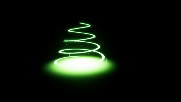
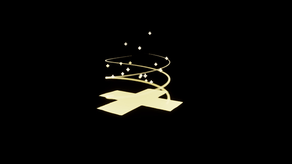
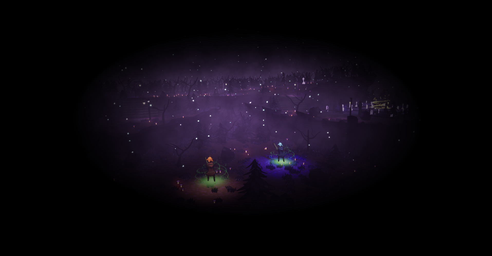
Another thing that was added was the Vignette Shader that will be used when the players get disconnected from each other. It strengthens the danger of the tether breaking and bings the players more into panic mode.
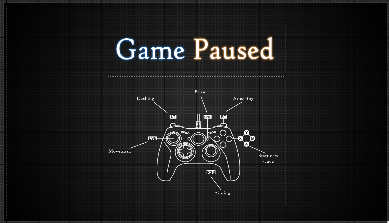
Furthermore a big thing that was worked on this week was the UI. From main menu to pause screen and gameplay screen everything was added and polished. Buttons were added, a font was chosen, some background was added and more. Now the UI is interactible and gives the players the needed feedback.
Programming
With our last hurrah of programming, our primary focus was working with the artists to fully implement our UI functionality.
Our first goal was to get the main menu UI working to be able to be controlled with the controller, keyboard or mouse while smoothly transitioning between them as well (as seen below showing input switching between mouse & controller).

On a topic of more proper polishing, we also added further improved our combat. Primarily focusing on stat adjustments to make the gameplay feel more fluid and enjoyable. The primary stat changes were with the enemies themselves, we adjusted the speed of them and the frequency of their attacks. Furthermore we increased the window of time that the players are invulnerable after receiving an attack, because prior there were too many scenarios where the players ended up being killed extremely quickly in the later waves.
Furthermore, we added better indication when an enemy was hit by adding a spark effect on them, as designed by our artists.

Another aspect of our game that we decided needed improvement in clarity & polish, was the tether indication. Prior to this it was not necessarily clear what the tether innately does, or whether you want to be connected or not, so we added a vignette that pulses in and out to create a sense of distress whenever the players are not connected. Furthermore (as could be seen in the gif of the prior section), with the help of our artists, the health bar also turns red as to push attention to that aspect of the UI for the players to notice it is going down.

We also improved and somewhat fixed the dash, properly allowing for our players to dash through the enemies to get back to their lost other player, allowing them to reconnect their tether.

Lastly, we fixed any remaining pesky bugs that we did not find earlier (or created during this week), such as in some places where enemies spawn the grave indicators rising way into the sky and some issues with our healing system particle effects.
Sound
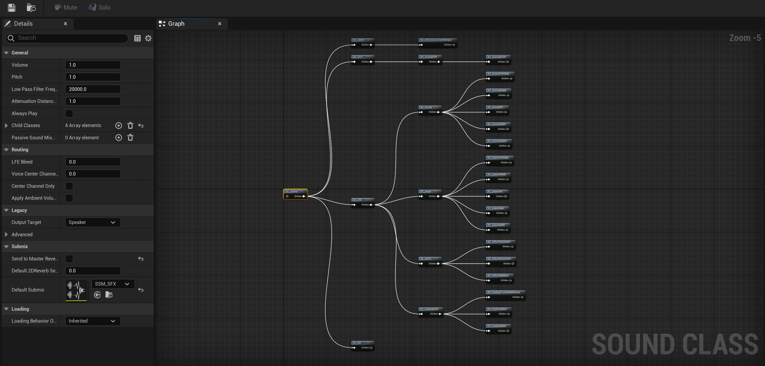
We did it! This is the final week of working on our game. After a long and arduous process, we were able to finish off our project on a high note. Audio wise, we focused on finishing off sound implementation and improving on how certain sounds were being played or called. A bunch of time was spent on optimizing timing and sound concurrencies. I added in one final sound to the game, enemy vocals. As I felt that it would add to the ambience and feel of the game, I added in enemy growls that get called randomly. To enhance the game feel, a bunch of creative effects such as delays, bit-crushing and distortion were made to be dynamically added in when the player’s health gets low. And finally, The last stretch was spent on creating a final mix for the game, giving it one last listen through different monitoring situations so that I could give the audio a bit of a shine before pushing it through.
Get Familiar
Familiar
Two siblings fight their way through a mysterious forest while connected by a tether symbolizing their innate bond.
| Status | In development |
| Authors | ZainAlRubaie, Milena Agienko, cancuratan, Bwiek, BenjaminLooyens |
| Genre | Action, Survival |
| Tags | 3D, Atmospheric, Dark, Fantasy, Hack and Slash, Unreal Engine |
| Languages | English |
More posts
- Familiar[group16]Devlog10May 22, 2024
- Familiar[group16]Devlog9May 16, 2024
- Familiar[group16]Devlog8May 08, 2024
- Familiar[group16]Devlog7May 02, 2024
- Familiar[group16]Devlog6Apr 24, 2024
- Familiar[group16]Devlog5Apr 18, 2024
- Familiar[group16]Devlog4Mar 27, 2024
- Familiar[group16]Devlog3Mar 21, 2024
- Familiar[group16]Devlog2Mar 14, 2024

Leave a comment
Log in with itch.io to leave a comment.